The Scene Panel
The Scene Panel is Karabo’s default container for showing or editing scenes. Scenes in Karabo provide a way to customise device views, covering any diagnostic or control elements in a compact and comprehensive view. The image below shows an example of a master panel in a central scene. Each one of this components will be described in this document. For now, It’s relevant to notice that we can represent the relations between devices, access the system state and even provide links to sub-systems with their respective scenes (bottom right).
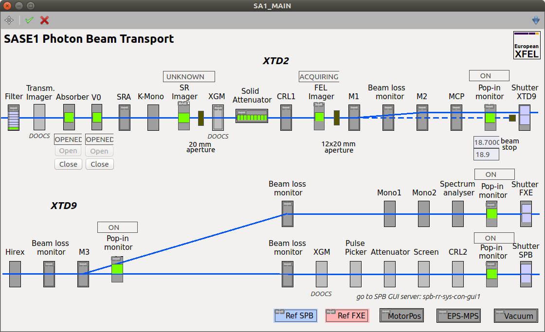
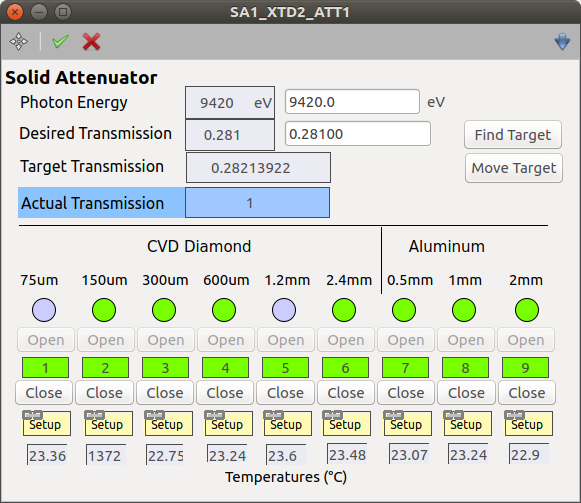
The following example shows a detailed panel in a central scene. We see how customizable a scene can be, offering display values for gauges, spark lines indicating trends, state and alarm conditions, etc. Note how the state and alarm condition are separated for the gauge Gauge_Down2. The bottom buttons are hyper-links to the other detail panels and the master panel.
A Karabo scene is not necessary created by a graphical user interface (GUI), also devices can have scenes where they can be downloaded from. If a scene is derived from a device, it is typically shown in control-mode only, meaning that no manipulation of the scene elements can be done.
For editable scenes, a project is also needed. After creating a project, the operator can create a new scene or load a previously created one and is free to start customizing it and saving/replacing it in his project. For this customization, Karabo provides a variety of features that can be used via the Scene Toolbar and widgets, the so-called Karabo Controllers.
Scene Toolbar
The scene toolbar houses necessary tools for editing the scene.

A - Enter design mode, where it is possible do add/remove/modify objects
B - Accept or discard changes
C - Selection tool
D - Enable/Disable Grid snapping
E - Insert text field
F - Draw line
G - Draw rectangle
H - Create Scene_Link
I - Create Web_Link_
J - Layout customization for Widget_Layouts
K - Tools for selecting all items, copying, pasting and deleting
L - Actions for moving objects. Also accessible using the key strokes (arrow keys)
M - Bring selected item(s) to front or send to back
N - Base options: Dock/Undock/Maximize
Widget Layouts
Configuring the correct widget layouts can be tricky. For grouping widgets in a common layout, first it is needed to select the desired widgets using the tool C shown above. With this tool, the user is able to either make a rectangle selection (please note that the whole widget must be inside the rectangle) or manually select all widgets while holding the Shift key. After the selection, if is possible to group the widgets in a layout (tool I) in any of the following manners:
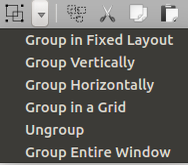
Group in Fixed Layout: the widgets will be grouped as they are;
Group Vertically: the widgets will be grouped in row major, where each widget will occupy one row of the layout;
Group Horizontally: the widgets will be grouped in column major, where each widget will ocupy one column of the layout;
Group in a Grid: the widgets will be grouped in a grid. The row and column count will be defined more or less based on the current widgets location. That means that the user still need to drag the widget where they are supposed to stay. Note that it is impossible to correctly group the widgets exactly as the user meant, but it offers good results in most of the cases;
Ungroup: ungroup already grouped widgets. You may want to ungroup the default property layouts to provide some finer-grained layouts for your scene;
Group Entire Window: auxiliar tool for grouping the whole screen as it is.
When dragging a property from a device instance into the scene panel, this property comes along with, maybe, some labels and additional widgets, all grouped in a proper layout. If a more concise grouping is needed, it might be needed to ungroup these layouts and group them again as needed.
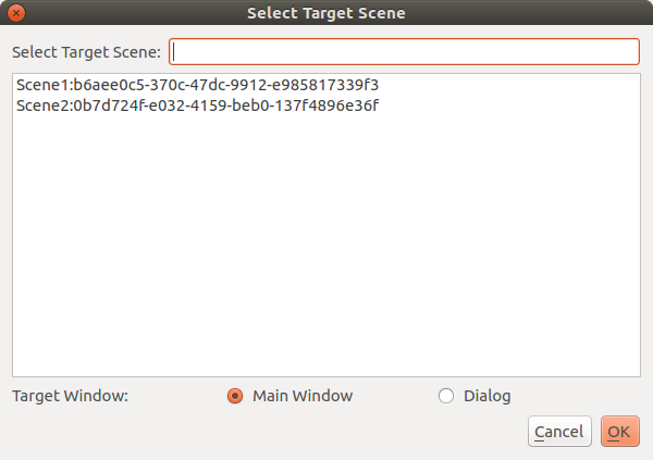
Scenelink - Hyperlinks between Scenes
It’s possible to link between scenes using the scene link widget. For this, please go to edit mode of the scene and select the tool Add scene link to scene from the toolbar. Afterwards, click on the scene and a dialog will pop up for configuration.
Scenelink - Hyperlink widget:
In this configuration window the target can be selected as well as the link widget should open the scene in the Main Window, or in a new pop-up Dialog.