Exporting Data
You can use Grafana to export data you are viewing into a comma separated value (CSV) file, which can be read in with most data anaylsis tools and environments.
In the panel containing your data click on the dropdown of the panel title:
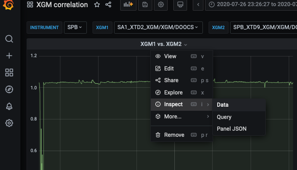
This will open a context menu. You’ll find the export option by clicking Inspect->Data.
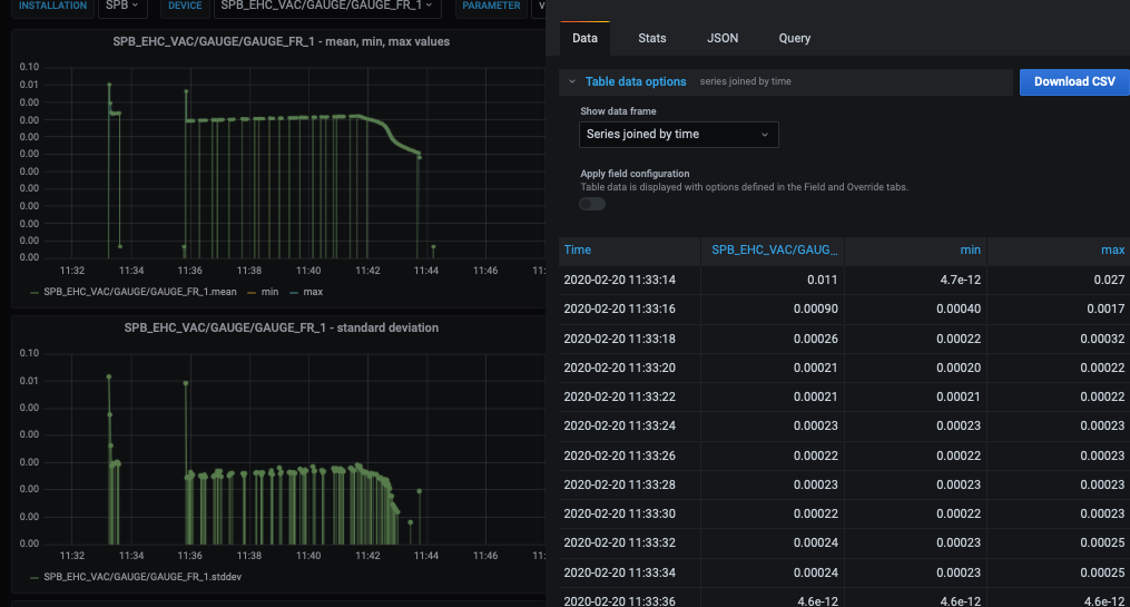
A panel on the right side should now open giving you export options:
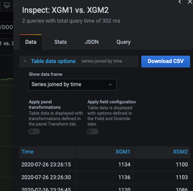
In the default setting all data series contained in your panel will be output to their own column in the CSV file. The left-most column gives a timestamp in ISO format.
You can also select only individual series to be output:
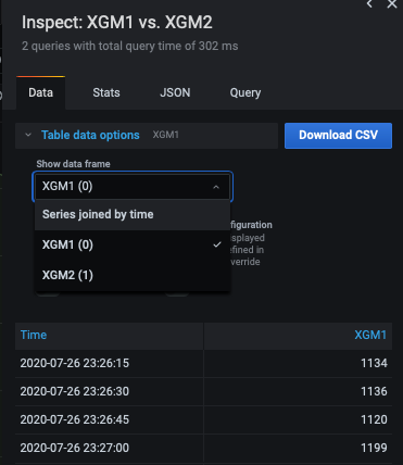
or toggle the Apply panel transformations switch to output data any transformations produce. In the XGM correlation example shown here, this switch needs to be toggled to export the data plotted in the panel, as it is based on a transformation:
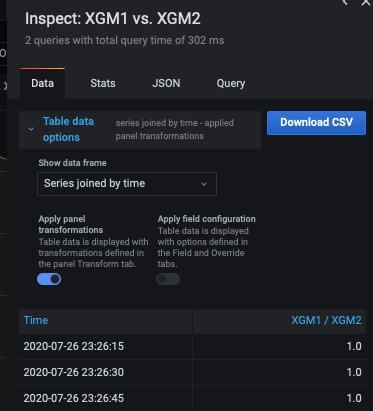
The CSV files generally then look like the following:
Such files can e.g. easily be imported in Jupyter via numpy or pandas:
from dateutil.parser import parse
import numpy as np
import pandas as pd

# import in numpy, converting ISO date time to timestamp
d = np.loadtxt("XGM1 vs. XGM2-data-as-seriestocolumns-2020-09-11 10_27_05.csv",
               skiprows=1, delimiter=",", converters={0: lambda x: parse(x).timestamp()})

# import into a Pandas dataframe
df = pd.read_csv("XGM1 vs. XGM2-data-as-seriestocolumns-2020-09-11 10_27_05.csv",
                 sep=',', header=0)
Note that in the pandas example time information is imported as string values.
Warning
Grafana has a timeout of 30 seconds on queries. Thus you might need to split large data series in multiple time periods if you want to export fine-grained long-term trends. However, consider using the InfluxDB inbuilt aggregate functions to calculated e.g. min, max, mean and standard deviation while binning data on larger time intervals.
Reducing and Selecting Data For Export
Before exporting large time periods of data it is often worthwhile to use Grafana to narrow down times of interest for a given data series. For this statistical aggregation functions can be used, which are provided by InfluxDB itself. A list can be found here: https://docs.influxdata.com/influxdb/v1.8/query_language/functions/
Consider for instance a gauge in SPB. We want to narrow down such time intervals, which show sudden changes in pressure. At first we look at the mean value of the gauge over the last 6 months:
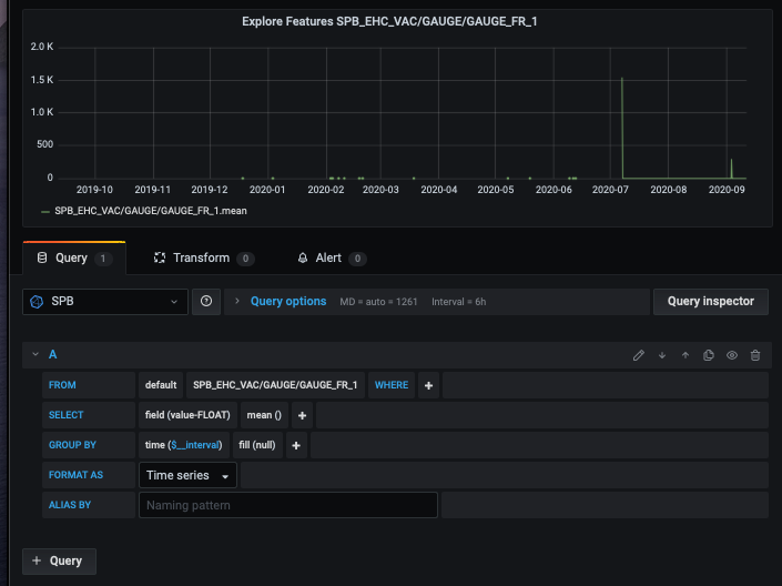
We observe that there are areas without data and a few spikes. However, the data covers a wide range of values, so we are not sure if we actually see all “points of interest”.
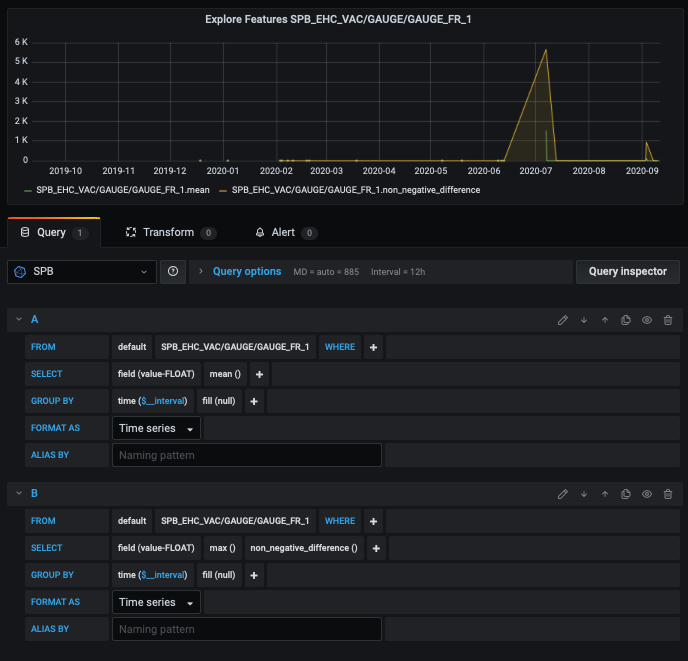
We can use aggregations to highlight sudden changes in value. In the example below we use the maximum non negative difference of subsequent values. The peaks are now much more visible:
In the General->Series Stats dashboard quite a few of these statistial functions are aggregated into a single dashboard. It is parameterised to easily select a device and expected parameter from the dashboard interface. Furthermore, the y-axis scale is logarithms further highlighting changes:
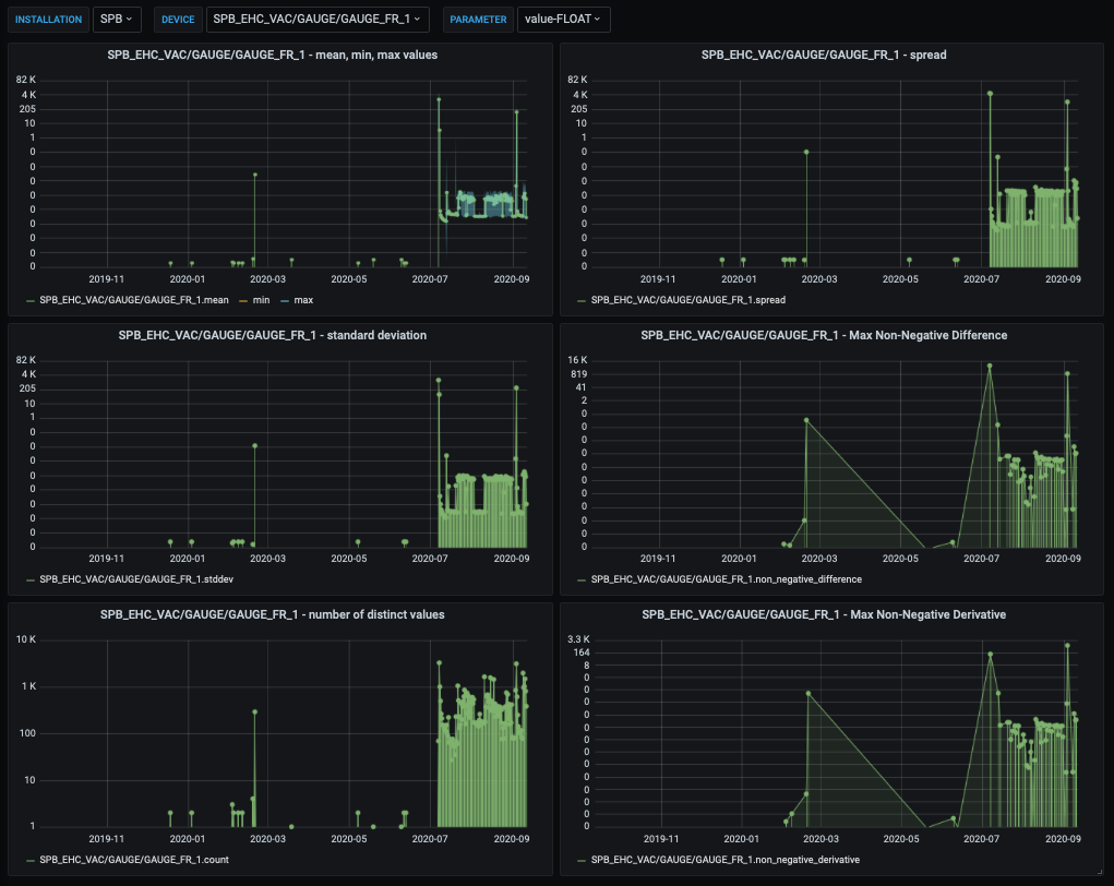
For our gauge we e.g. see that for Feb 20 there is an interesting behaviour of the pressure. We can now zoom into this day and then export this data much more fine grained:
