The Configuration Panel
The karabo GUI application offers a dedicated panel for device interaction.
By means of this panel, often also referred to as Configurator, it is possible
to view and alter the device’s:
Properties: ranging from primitive types (bool, int, float, string) to more complex data structures like images, vectors and I/O channels
Attributes: further specify properties (bounds, units, shape, etc)
Slots: buttons that when clicked execute some action on the target device (turn on/off, read data, move, etc).
A device can be selected either from one of the Navigation Panel. This can be either
the System Topology, the Device Topology or the Project that contains it.
Only in the case when an offline device is selected (device class), the operator
will be able to modify its default properties. In case of an online device
is selected (device instance), the current device properties will be shown.
Each property or attribute has an associated icon that helps identifying the type.
Type |
Property |
Attribute |
|---|---|---|
Boolean |
|
|
Floating point |
|
|
Integer |
|
|
List |
|
|
Pair |
|
|
Schema |
|
|
String |
|
|
Undefined |
|
|


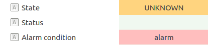
Also, properties like States or that display any type of Alarm are properly colored.
Note
The user will only be able to access the device properties accordingly to its access level (Admin, Operator, etc).
The Configuration Editor Toolbar
From the toolbar of the “Configuration Editor” the device configuration can be loaded (A) from an xml file or saved (B) to an xml file, using the dedicated icons:
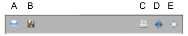
Besides these actions, the user can Print (C), Undock (D) or Maximize (E) the panel.
Device Configuration Example
The following image shows, as an example, the configuration panel for the DataGenerator class using the Admin
access level. The panel has only two columns:
The property or attribute name
The current default value
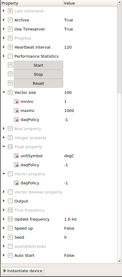
Readonly and reconfigurable parameters can be differentiated by color. Readonly parameters have a grey color as they are less important for a default configuration.
In case of an online DataGenerator device, as shown in the image below,
one additional column appears, which is used to view the device’s online value.
Additionally, two extra buttons for accepting and declining changes, are appearing.
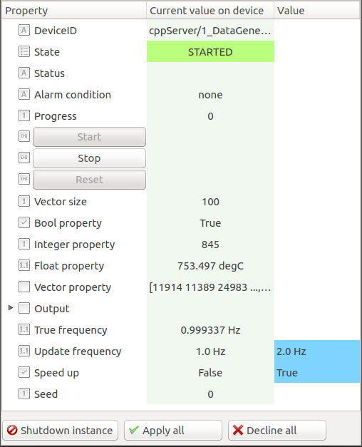
In this instance we can visualize:
Read-only properties: State, DeviceID, Bool property, Vector property, True frequency, Output, etc.
Read/write properties: Update frequency, Speed up
Slots: Start, Stop and Reset
When we modify a property and did not apply the changes to the device, its changes
will be highlighted in blue, as seen on Update Frequency and Speed Up fields.
It is possible to apply the changes via the Apply all button,
or rollback the changes to their previous value with the Decline all button.
Value editing can also be done by immediately pressing Enter key to apply the value or
or cancel the modification by pressing the Escape key.
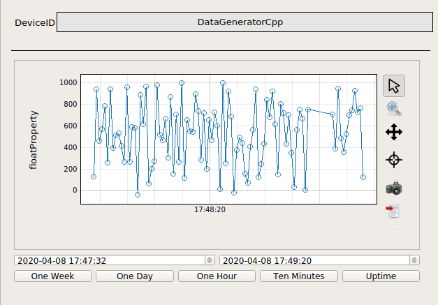
For every property displaying a value, double-clicking its “Current value on device” (green column) will provide a Trendline Scene showing its evolution over time. For instance, the following image shows the evolution of the Float Property.
Property Information
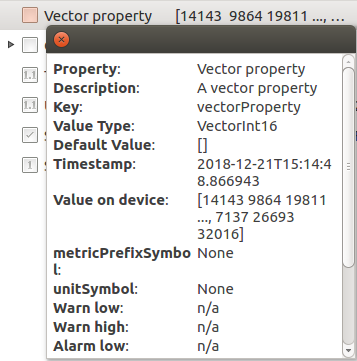
To obtain more information about a property, the operator can click on its type icon. For instance, for the vector property, it is possible to access a detailed description containing the timestamp, the data type and important attributes such as alias, tags, minimum and maximum values, etc.
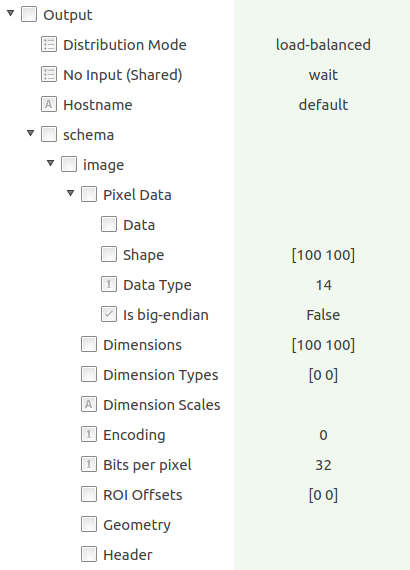
The DataGenerator instance has an Output channel where the user can have access
to the generated image data.
Image Data is essentially a noded data container. By clicking
on the arrow icon beside the component it is possible to view the encapsulated
properties that define high and low-level information about the image
(encoding, ROI offsets, shape, etc).