Widgets - Controllers and Conversion
Every property type has a default widget. For example, a bool property will be translated
to a Checkbox. An editable input to a Text Line Edit, etc.
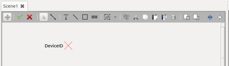
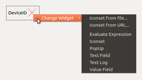
It is possible to convert from one widget type to another for
customization. In order to mutate a controller widget please select the widget and
right-click to show the custom menu.
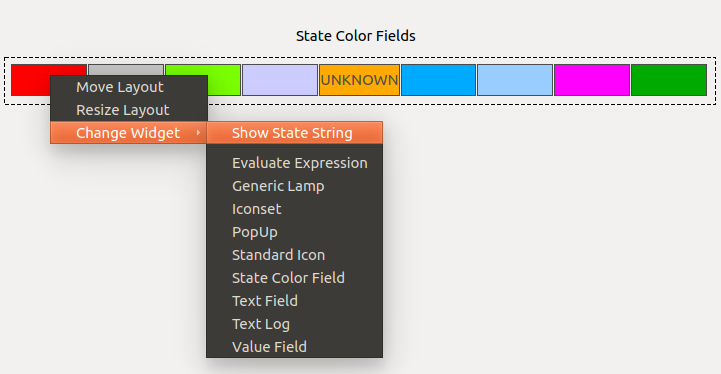
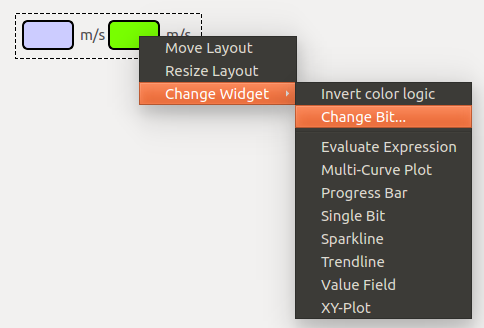
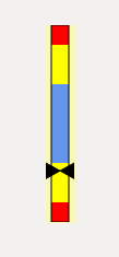
The picture below shows the possible conversions for a State property. The default
controller is a State Color Field widget.
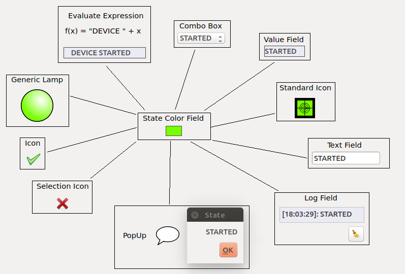
These conversions offer a vast range of scene customizations.
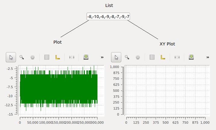
Other common conversions are from vectors to plots. A vector property (list of values) can be seamlessly converted to a Plot, as shown in the following Figure. As it is known for the XY Plot, one more vector is needed for the plot to be valid.
Basic Widgets
The Tables below offer a cheatsheet regarding the possible widgets the user can choose for displaying primitive types.
Basic Widgets |
|||||
Integer |
Float |
Boolean |
String |
Vector |
|
R |
R |
R |
|||
W |
|||||
R |
|||||
R |
R |
R |
|||
W |
W |
||||
RW |
|||||
R |
|||||
W |
W |
W |
|||
RW |
|||||
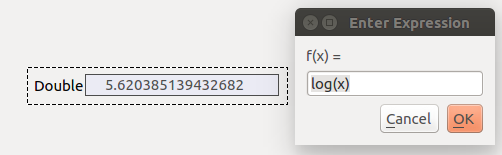
Evaluate Expression
This widget can be used to manually define the formatting using python string
formatting ("{:.2f}".format(x)) or to derive another value with a function.

The full namespace of python builtins and numpy can be used to define
the function. The example below uses the log function of numpy.
Note
The Evaluate Expression widget background is colored according to the alarm
and warning attributes of the property if the value exceeds a threshold.
List
The List widget is used to display vector properties. This widget is used
for both displaying and editing vector properties and does not
provide any alarm information.
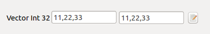
The edit widget provides a list dialog which can be opened by clicking on
the button to the right.
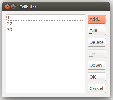
The list dialog offers a comfortable way to modify vectors with a large number
of elements.
Value Field
The Value Field refers to a default widget for representing values. It is typically chosen as first widget
when a normal readonly property is dragged onto the scene.
This widget is able to visualize and work with defined property displayTypes of ‘bin’, ‘oct’ and ‘hex’.
If the property defines one of the attributes absoluteError or relativeError, the widget will derive the
formatting display.
For floating point properties a maximum precision of 8 is provided.
Note
The Value Field widget is one of the first choice elements to display
alarms and warnings of simple property types. The widget background is colored
correspondingly and the value exceeded an alarm value.
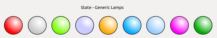
Generic Lamp
This widget is used for string properties which have a displayType State, the so-called State Elements.
The property value is displayed with the corresponding state color.
State Color Field
This widget is used for string properties which have a displayType State, the so-called State Elements.
In addition, this widget comes with a context menu action to display the state string on the widget!
Single Bit
This widget is used to visualize single bits from integer properties. It has a rectangular rounded shape and comes with two context menu options:
Change the
bit numberto evaluateInvert the color logic
By default the State.ACTIVE is used when the Bit is actively set!
The State.PASSIVE color then illustrates if the Bit is not set.
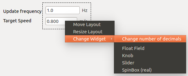
SpinBox
The spinbox can be referred to as a standard widget in every Qt application. This widget comes with two context menu options
The number of
decimals(default: 3)The
stepsizewhich is can be eventually used for stepping (default: 0.0)
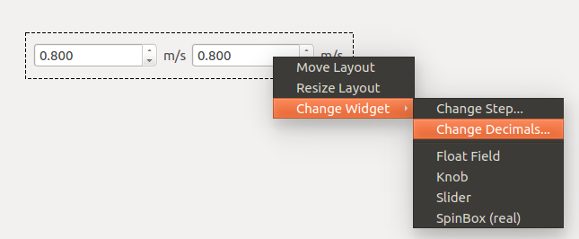
Note
The stepping via a spinbox widget is achieved by using arrow key-strokes!
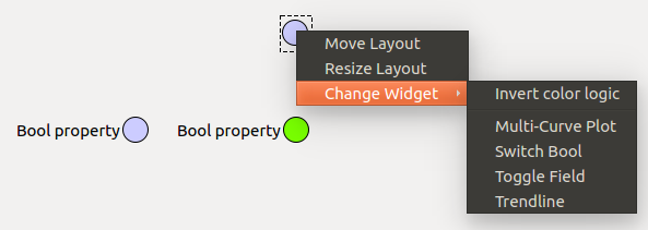
Switch Bool
Shows the operator the state of the bool property with colors in a circular shape.
By default the State.PASSIVE color is used for False and the State.ACTIVE
color belongs to True. The logic of the coloring can be toggled via the
context menu of the widget.
Text-Float-Integer Field
The field boxes are building the default widgets for editing the
property values of basic float, integer and string types.
In addition, the Float Field has a context menu option to assign the number
of decimals. The default value (-1) disables the decimal formatting. Once, a
decimal has been specified, a validator will take care of correct value input.
Toggle Field
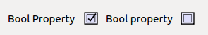
As the default widget for a boolean this widget simply shows the True and False
with a check-mark in a box.
The Table Element
The table-element is applicable for VECTOR_HASH properties, which have a ‘rowSchema’
attribute. The rowSchema is a Hash, which defines the column layout, i.e. column count, column data types and column
headers.
In case the table description (rowSchema) contains a ‘displayedName’ field for a property this is used as the column header, otherwise the property key is used.
For string fields with options supplied the cell is rendered as a drop down menu.
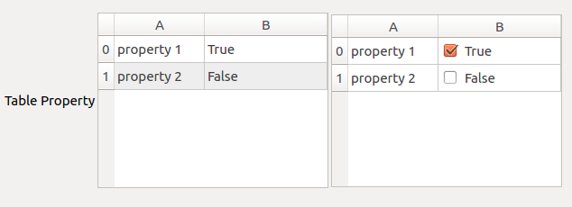
Boolean fields are rendered as check boxes.
Additional manipulation functionality includes, adding, deleting and duplicating rows (the latter require a cell or row to be selected).
The Table widget supports drag and drop of deviceId’s from the navigation panel. Dropping on a string cell will replace the string with the deviceId. Dropping on a non-string cell or on an empty region will add a row in which the first string-type column encountered is pre-filled with the deviceID.
Functional Widgets
Functional Widgets |
|||||
Integer |
Float |
Boolean |
String |
Vector |
|
RW |
RW |
RW |
|||
R |
R |
||||
R |
R |
||||
R |
|||||
R |
|||||
W |
W |
||||
W |
W |
||||
R |
|||||
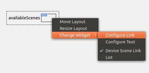
Device Scene link
The Device Scene Link is a widget that offer features similar to the one
offered by the Scene_Link_ but differs from it in the sense that the scene
offered is not stored by the project but generated dynamically by the device
itself.
In order to include a Device Scene Link one needs to drag and drop the property
availableScenes into a scene in edit mode and select the appropriate widget type.
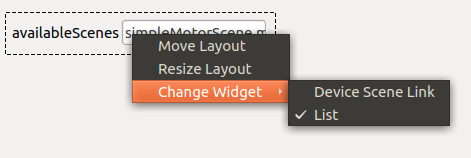
Once the property is on the scene one can adapt which one of the scenes provided by the
device, as well as the text and target panel similarly to what is offered by the Scene Link.
Analog Widget
The Analog Widget is fully designed to display alarms and warnings of a
property. It provides an estimate how far the actual value (indicated as black
scaler) is within or close to an alarm or warning region.
Note
For this widget a set of attribute values for alarms or warnings has to be provided.
Hence, either alarmLow and alarmHigh or warnLow and warnHigh
must be defined on the karabo property.
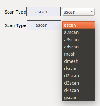
Combo Box
The so-called ComboBox widget is used to edit karabo properties which have a predefined selection of values. In the example shown below the Karabacon scantool has a fixed scan type selection which can be then edited.
Note
For this widget the attribute options has to be defined on the karabo
property with defined values.
Progress Bar
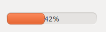
The Progress Bar widget shows to the user the property percentage value taking in consideration its maximum and minimum values.
Note
For this widget attribute values for a mininum value minInc or minExc and
a maximum value maxInc or maxExc must be defined on the karabo property.
PopUp
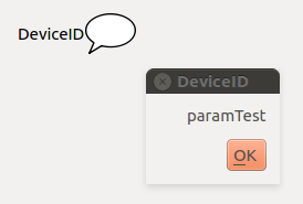
If the widget is configured as a PopUp, the value of the property will be shown in a pop-up dialog whenever changes occur.
Slider
The widget can be changed to a Slider enabling to comfortably slide through the minimum and maximum values of a property. This widget is typically used for gain or exposure settings in cameras.
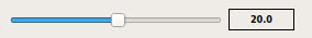
The widget comes with a number widget to show the current edit value. This can be optionally disabled. In addition, the step size of the slider can be configured via the context menu.
Note
For this widget attribute values for a mininum value minInc or minExc and
a maximum value maxInc or maxExc must be defined on the karabo property.
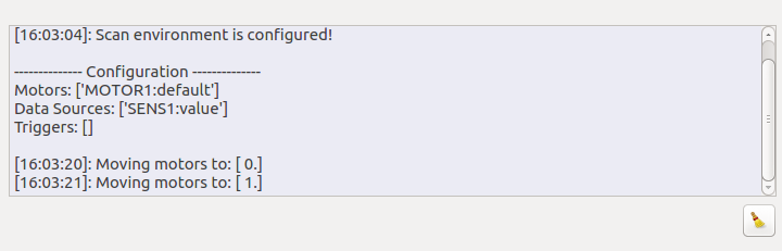
Text Log
This widget is typically used to display and log the status property of devices. Every value update with a new timestamp will be displayed. It comes together with a clear button and a timestamp for each value modification.
Icon Widgets
Iconset
This type of widget will just show a icon in the scene.
It’s possible to add an icon image using an url or from a file.
Icons
The ‘Value Field’ for an integer, a floating or a string property can be converted to an Icon Widget using the right click context menu item Change Widget -> Icons. The Icon widget can show an icon corresponding to a condition, for the value.
Custom icons can be set on Icon Widget depending on the property values. This can be done using the ‘Change Icons’ dialog. Use Icons:Properties-> Change Icons… right click context menu items to open the dialog.
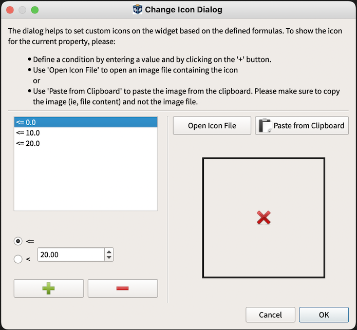
In order to define a condition, enter the value and hit “+” button. For floating properties the dialog provides radio buttons to choose the operator ‘<’ or ‘<=’. For integers the operator ‘<=’ is selected by default and the radio buttons are hidden.
For string properties with options, the dialog shows up with these options listed. For string properties with no pre-defined options, the dialog provides a widget to enter the value and hit “+” button to add it.
- Select the condition from the list and use
‘Open Icon File’ to open an image file containing the icon.
‘Paste from Clipboard’ to paste the image from the clipboard. Please
make sure to copy the image (ie, file content) and not the image file.
The preview of the imported icon can be seen on the right side of the dialog.
It is further possible to remove a selected condition via “-” button.
Plot Framework
Karabo has a builtin plot framwork based on PyQtGraph. Typically, a plot
comes with natively provided extra features which are shown in the Context Menu.
The context menu is accessible like in any other widget controller by selecting the controller
in the design mode of the scene and via right-clicking on the plot widget.
Commonly, axes configurations can be accessed via native double-clicking on the plot axes
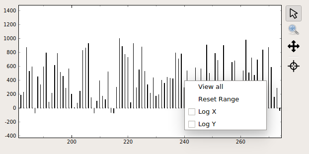
for the Axis Menu or a few settings can be adjusted via a right-click on the plot itself
to trigger the View Menu.
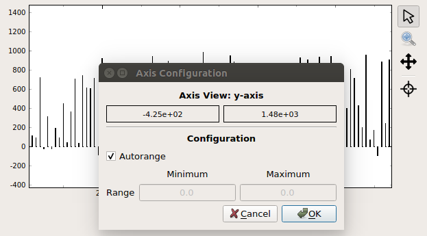
The Axis Menu is available to set the Range of the axis of interest. Either
autorange or a fixed range can be defined.
The View Menu offers the possiblity to autorange a plot or if available,
configure the linear or logarithmic scale of a plot.
The next sessions will describe all plot widgets available in Karabo.
Graph Framework |
|||||
Integer |
Float |
Boolean |
String |
Vector |
|
Vector Bar Graph |
R |
||||
Vector Fill Graph |
R |
||||
Vector HistoGram Graph |
R |
||||
Vector XY Graph |
R |
||||
Vector XY Scatter |
R |
||||
VectorRoll Graph |
R |
||||
MultiCurve Graph |
R |
R |
|||
Sparkline |
R |
R |
|||
Scatter Graph |
R |
R |
|||
Trend Graph |
R |
R |
R |
||
State Graph |
R |
||||
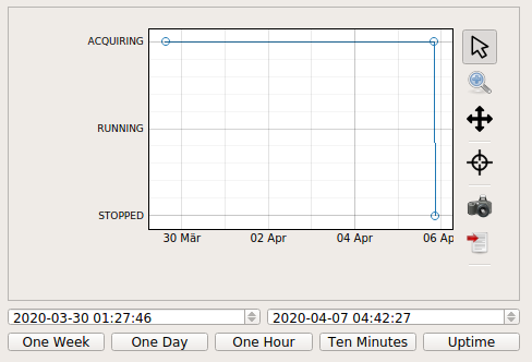
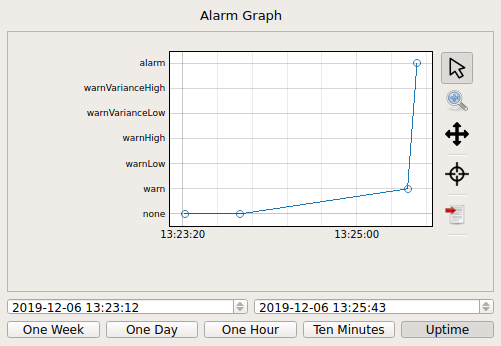
Alarm Graph |
R |
||||
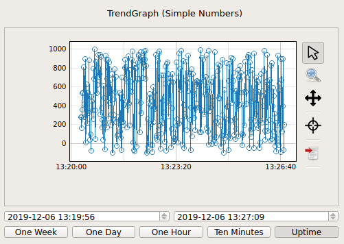
Trend Graphs
Trend Graph is a widget that shows the evolution of one or more properties over time. The plot itself offers quick access buttons to scale the trend data logs in either:
10 minutes
one hour
one day
one week.
The trend graph may be set to either display the full range of values or a detailed zoomed range. A trendline will provide automatic data reduction after 900 values. In addition, a trend graph can request historic data of up to 500 values from the Dataloggers.
Data will be requested when there is no data
Data will be requested when the x-axis is sufficiently changed (buttons)
Data will be requested when the operator zoomes in and has less data points
The same functionality is available for the State and Alarm properties
of devices.
Multi-Curve Graph
The multi-curve graph is the widget to choose if multiple properties have to be plotted with respect to a reference (x).
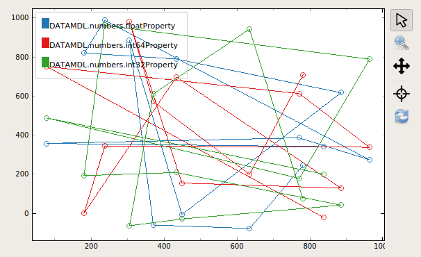
The property that is mutated for this controller is referred to as the reference property. Whenever this property is externally updated, the graph will add another measurement point. A typical use case would be a scan of multiple properties with respect to a reference. The toolbar of this widget is equipped with a reset button which can be externally armed with a boolean property.
Sparkline
The sparkline is similar to a trend graph and shows changes of a property over the selected time base.
The timebases can be chosen to be either 60 seconds, 10 minutes or 60 minutes
The sparkline maximum number of data points is 120 in an average fashion for all time bases
The sparkline will request historic data at the beginning
A change indicator arrow will provide the direction in case of changes larger than 5%
The minimum and maximum value of the bins are plotted in addition
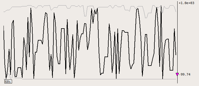
In this widget it is possible to disable or enable the alarm ranges via the context menu.